
PORTOFINO PACKAGING DESIGN
Putting Soul Back in the Dough
Portofino is a Canadian bread brand known for doing things properly. Their dough is slow-fermented for real flavour and they never cut corners with ingredients. It's honest bread with serious soul.
The brief was to create packaging that reflects the brand’s bold personality and commitment to quality. It needed to feel confident and rebellious.
RESPONSIBILITES:
Packaging Design. Production Oversight. Illustration Briefing. Lead Design Director.

DESIGN DIRECTION
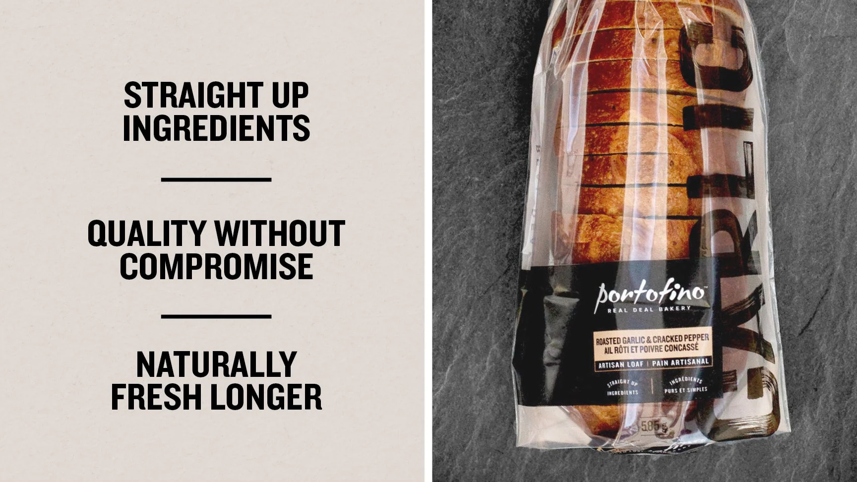
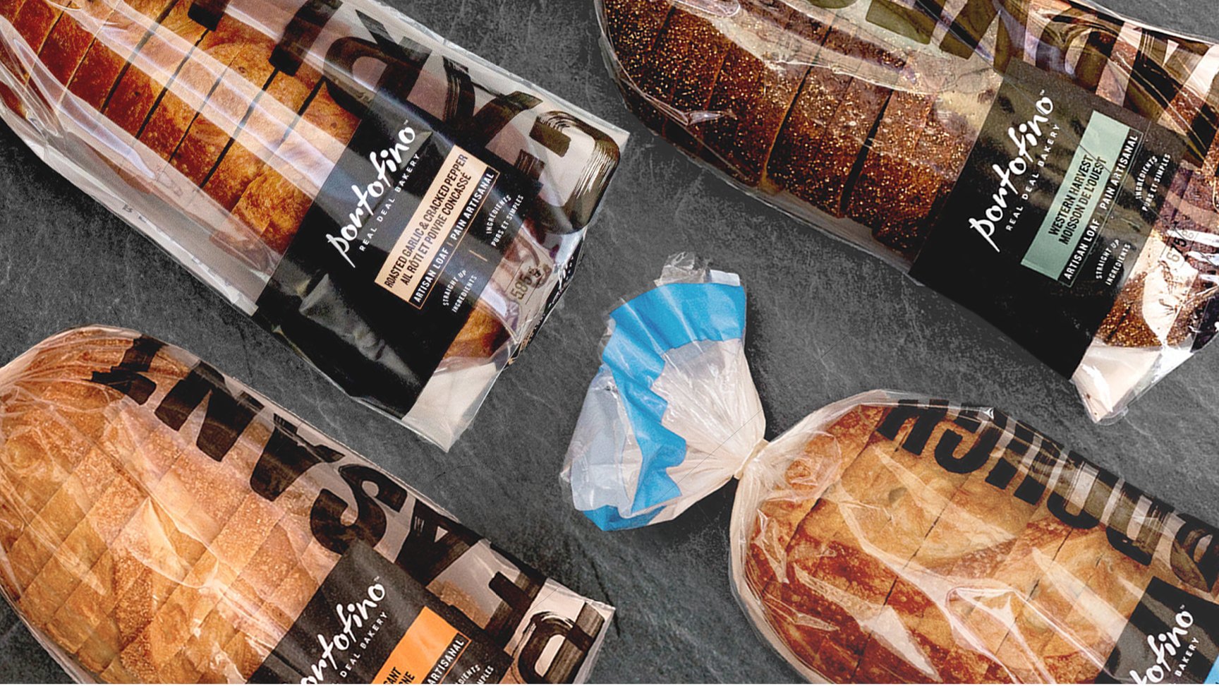
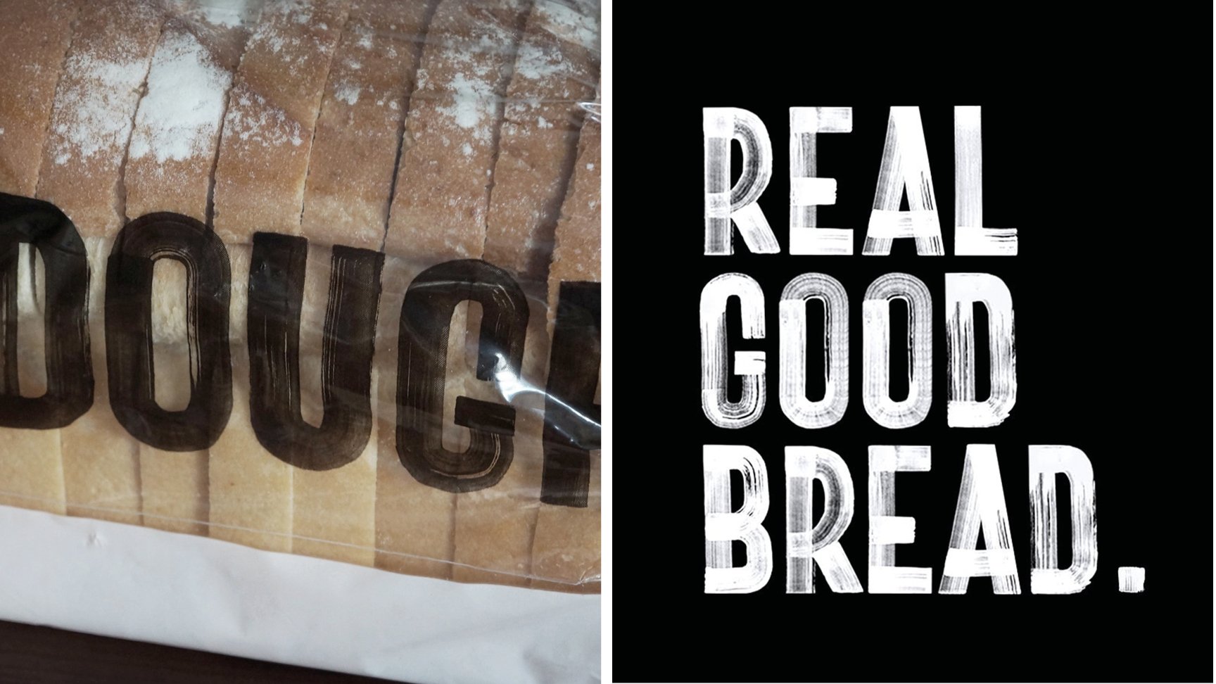
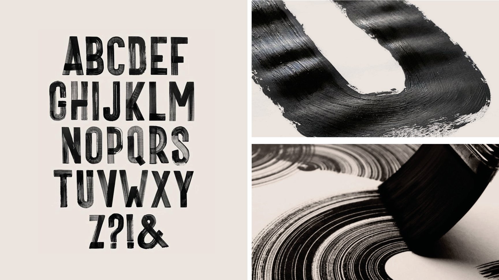
We developed a bold, expressive visual system with custom hand-painted lettering to bring a raw energy to the packaging. The type is loud, natural and imperfect—at the heart of the brand’s visual identity.
A strong layout system was built for shelf presence with textures and messaging that reinforce the product’s honesty. This bread has nothing to hide. It’s made with real ingredients with a purpose.

Portofino doesn’t whisper. The brand speaks clearly and with confidence. The packaging reflects that same voice. It is straightforward, bold and honest.
It proudly stands up for what matters and that is real ingredients, real flavour and a commitment to doing things the right way without taking shortcuts.
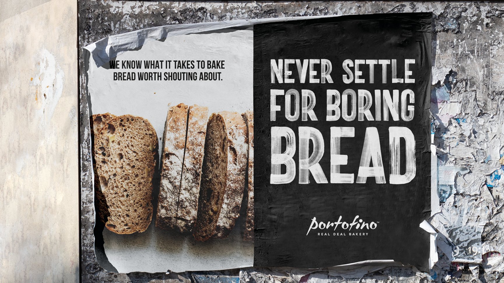
Bread Worth Shouting About
The result is packaging that stands out and feels personal, even on a large scale. It keeps the brand’s loyal following while making a clear statement in the bread aisle: good bread should never be boring.
