
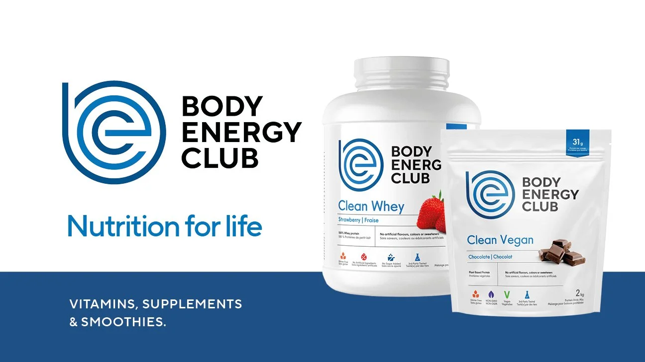
Body Energy Club
Modernising a Wellness Favourite for Clarity.
Body Energy Club is a long-established wellness brand with locations across Vancouver, Los Angeles and Chicago. As the health and fitness landscape shifted toward more inclusive, lifestyle-led behaviours the brand needed a refreshed identity and packaging system that felt modern, welcoming and clearer for customers across their large supplement and superfood range.
Responsibilities
Brand Identity. Packaging Design. Product System Planning. Production Design Lead.
Design Direction
The refresh focused on redefining the visual identity while keeping ties to the brand’s roots. We modernised the blue-and-white colour palette, refined the mark and typography and built a cleaner, more confident presence that works both in-store and online.
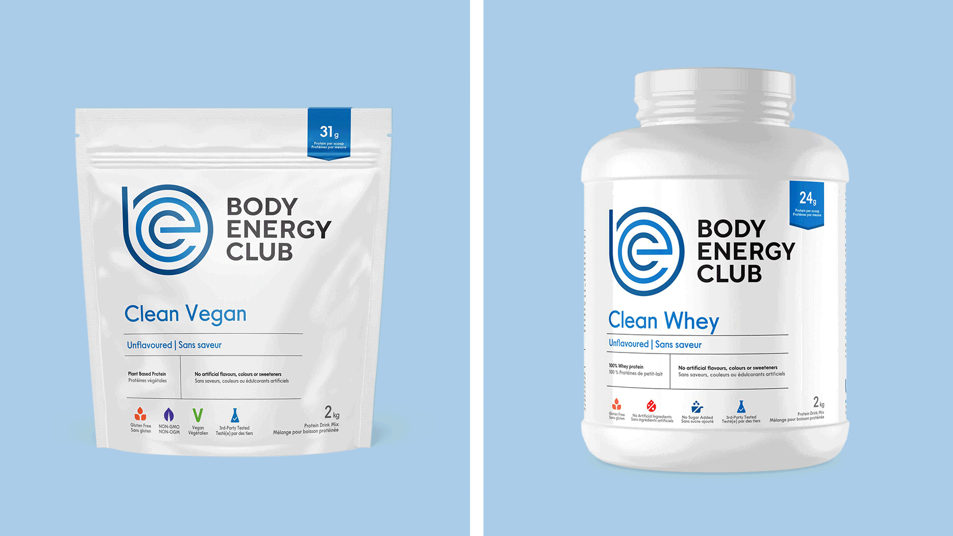
With a wide SKU count and multiple product categories the challenge was to create a packaging architecture that felt unified but flexible. We developed a clear product navigation method that improves on-pack clarity and makes the range easier for customers to understand and shop.


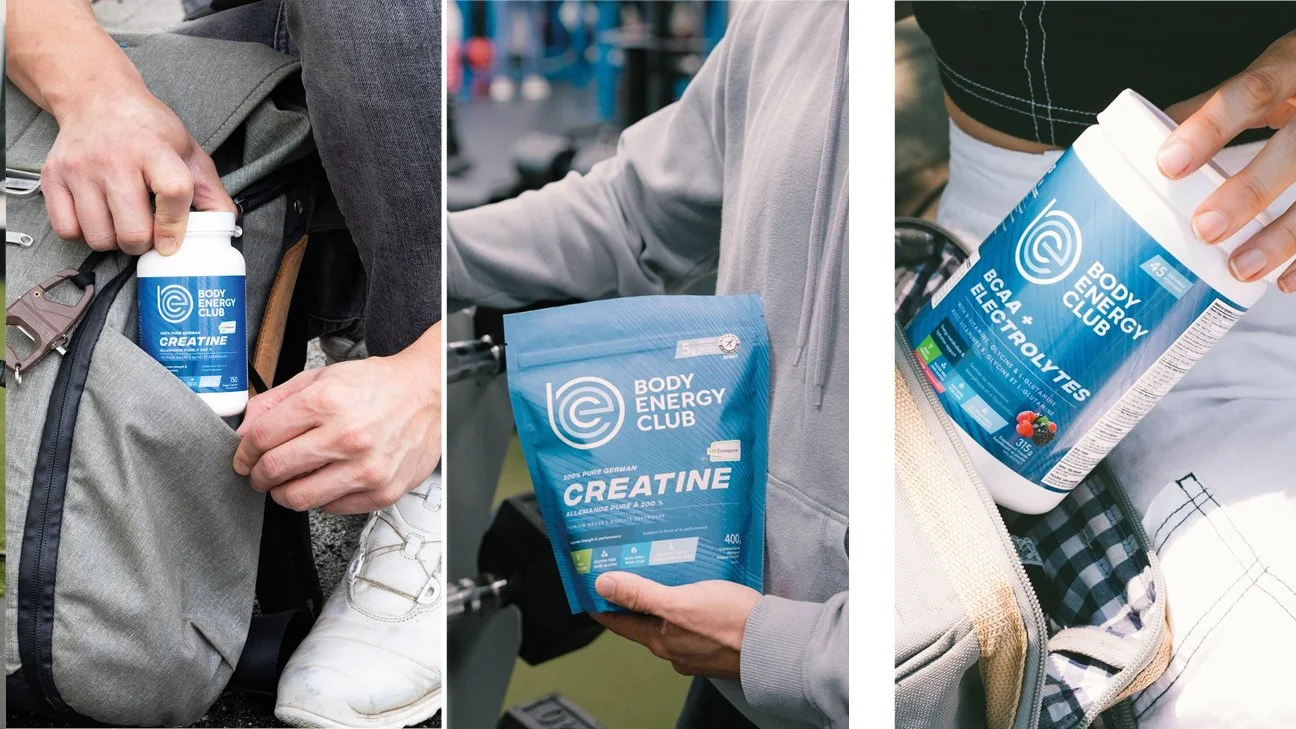
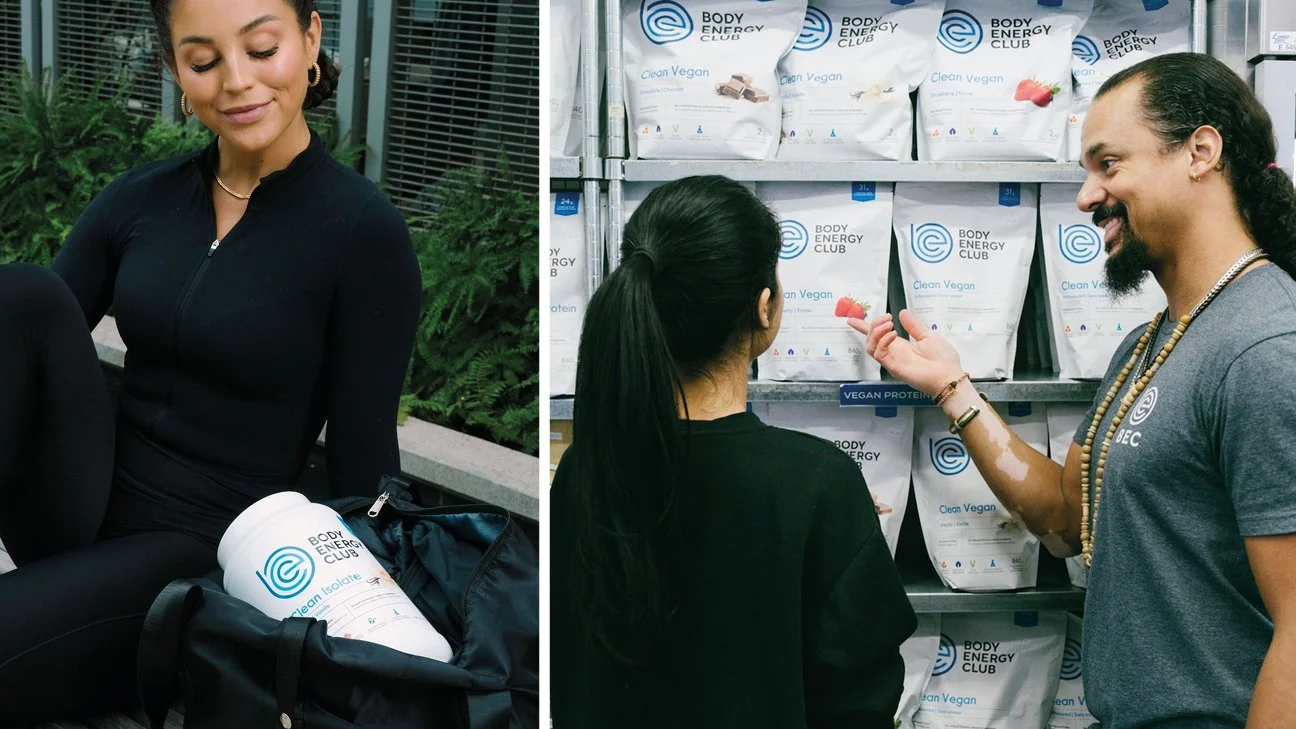
This full brand refresh strengthened Body Energy Club’s visual presence across every touchpoint, amplifying recognition while establishing a stronger, more approachable identity for today’s wellness audience.
By tackling a complex SKU system and resolving the packaging architecture the new design delivers clarity, consistency and ease of navigation. This helped to support the brand’s growth as it continues expanding across North America.

